The best user experience, is self made

What is Stylus?
Stylus is an extension for your browser where it can allow you to edit the visual styling of websites. It also has a lot of styles for download other users created which you can find by clicking Find styles. A similiar extension that a lot used to use was Stylish[0][1], but that was found to be tracking users and ultimately killed.
Anyways this is a rundown on how to get started and how you could use Stylus. Maybe you want a Dark Theme for HackerNews? What about moving some element on a website you use to make it easier to navigate through? Create your own prefered user experience.
Download:
- Chrome: https://chrome.google.com/webstore/detail/stylus/clngdbkpkpeebahjckkjfobafhncgmne
- Firefox: https://addons.mozilla.org/en-US/firefox/addon/styl-us/
Using Stylus
Once the extension is added to your browser, left click the icon. You have a couple options, Turning all styles off, Finding styles other users created, a button for inline to display the results of the previous: finding styles, then write styles for this, and a link to the current page, as well as buttons for manage, options, and wiki.
The ones I frequently use is, turning off all styles: to toggle edits that I’ve made to see how I could improve them better without getting distracted by the current edits. And also the link that says Write Styles for: The cool thing about this link below this is that it is hoverable, you can hover the far right and it will create a style for the current page: this URL. Otherwise, you can click the begining part of the link and create a global style for the entire website. When deciding which one is better for you, first figure out what you want to do and how it might effect the other parts of the website that you might use all the time.
In Use
Use stylus to edit the pages you’re seeing errors in Google Dev tools. While you’re actively tweaking things, think of Stylus as a way to save what you’re editing in Dev tools; do this to see changes live without having to save it to your server, then wait for your style.css cache to refresh. This is much faster and here is a small example, of something I did using this post.

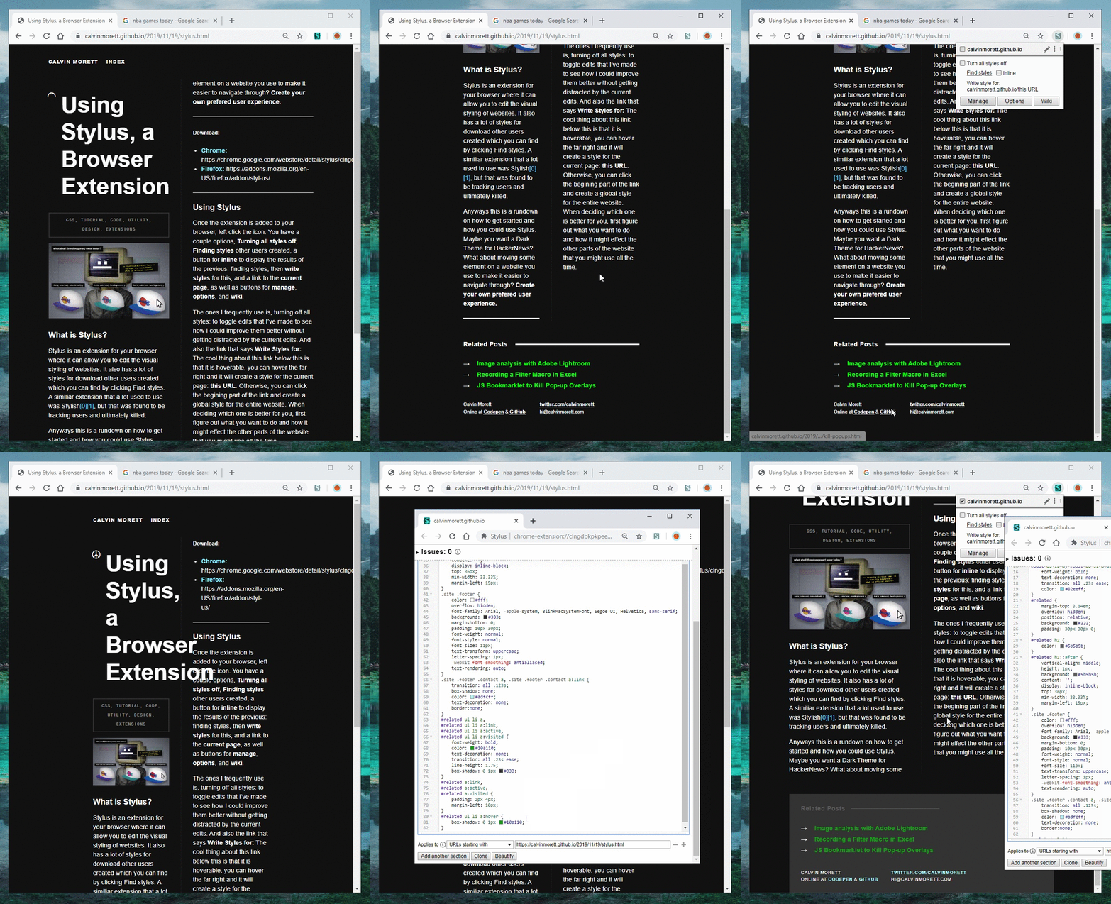
Above: As you can see, the .site class in my CSS was showing min-width: 50vw and skewing columns when the site was a little smaller. So in this case, I used it to edit this down on the fly and make sure if you had a smaller browser, then the site wouldn’t look totally messed up. To fix this, I removed the min-width and made it the max-width, then set the min-width to something I was comfortable with visually. All without having to save the style.css and refresh the site to see if it’s where I want it. In the future I plan on posting about some of the popular sites edits that I use, and make some of the sites more enjoyable.